
Website Color Palette Extractor
Quickly Extract Colors from Any Website
The Website Color Palette Extractor extracts the major HEX colors used in the design of a public web page. Designers, developers, brand owners, and all sorts of content teams can see background colors, text colors, accent colors, gradients, visual consistency, and more, without having to manually pick colors from a snapshot or photo.
This application takes the guesswork out of color research. The live interface displays the colors in use, their frequency, and their interactions. You can use this application to brand, create new pages, unify visual themes, and ensure design consistency.
What's a website color palette extractor?
A website color palette extractor is a tool that extracts the colors used in a live web page’s design. It breaks down visual styles like backgrounds, text, borders, accents, shadows, gradients, and interface elements. It then takes those colors and makes a striking palette out of them.
Instead of manually clicking around with a color picker or taking screenshots, you can scan a URL and get structured color data. The data gives insight into the direction of brands, the consistency of the UI, accessibility, and the health of design systems.
Why should you eliminate website colors?
Color impacts trust, readability, conversion, and brand recall. A strong color system will help visitors identify a brand, understand calls to action, and read content easily.
Bad colors have the reverse impact. The contrast isn’t beneficial, and the text is difficult to read. Too many random colors can make a site appear inconsistent. Important buttons are hidden in low-accent areas. A reliable website color extractor can help you catch these problems before they hurt the user experience.
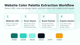
How to Use the Website Color Palette Extractor
Step 1: Copy the Site URL
Enter the URL of the website you want to analyze. Analyze your own site, a landing page, a competitor page, a client website, or any public page you want to obtain color inspiration from.
Step 2: Choose the Depth of Scanning
Choose the number of pages you want the tool to scan. Quick little research. Another great idea is, if you want to scan a whole website for design consistency or document brand colors on different pages, to do a deeper scan.
Step 3: Get a Palette
Scan successful. The tool will display the colors in groups. Here you can see the dominant colors, brand colors, background colors, text colors, accents, neutrals, gradients, and a recommended palette.
Step 4: Copy/Export Your Results
Select a color to copy its HEX code, or copy the full palette or export the results to fit your workflow. The tool also supports common developer and design formats so you can take your research to implementation in no time.
Important features that make this tool useful
Color Analysis for Live Website
The tool analyzes live website styles and does not depend on image pixels. With this method, you get cleaner color data because you are reading colors from the actual interface, including text, backgrounds, borders, and UI components.
Color Dominance Detection in
The extractor extracts the most common colors. Usually, the main colors are the ones that set the visual tone of a website, so they give you an idea of what the main brand direction is at a glance.
Brand, Accent, Text, and Background Groups
Hex codes can make a list a bit messy. This tool structures colors into meaningful roles to simplify the palette. You can easily distinguish the main brand colors from secondary accents, colors of readable text, and neutral background colors.
Gradient Detection
Gradients are a popular design element on modern websites, used in hero sections, buttons, cards, and decorative backgrounds. The tool is aware of gradient styles and shows the colors inside them, so you don’t lose a crucial part of the design system.
Fast Filter Chips
Quick filters allow users to sort colors more quickly. You don’t have to scroll through the whole palette by hand, you can sort by light, dark, bright or neutral.
Fresh Analysis
Recent analysis saves you time if you repeat research on the same sites. You can go back to previous URLs, re-run checks, and compare results without having to type the same address.
Comparison Lab
Contrast lab experiments with text and background combinations. It’s easy to tell when a color combination works with readable content, and you can check as you go when designing accessible interfaces.
Built for Designers, Developers, and Brand Teams
Designer UI/UX
With the tool, designers can learn about visual systems, make mood boards, create palette references, and understand how successful websites implement color hierarchy. It allows you to do design research faster and cleaner.
For Web Developers
Developers can extract color values and export them in implementation-ready formats. Rather than just pulling colors out of random CSS files, they spit out CSS variables, SCSS variables, Tailwind colors, JSON tokens, and all kinds of useful stuff.
Brand Management
Brand managers can verify that a website is using the correct brand palette. Consistency score, role grouping, and snapshot comparison show color drift across campaigns, landing pages, and redesigns.
For SEO & Conversion Teams
Keywords aren’t the be-all and end-all when it comes to search performance. It should also be reliable, readable, and user-friendly. Color consistency and contrast enhance the user’s interaction with headings, buttons, forms, and calls to action.
Good news? I like your design. Sorry to say that this page has no ranking. Perform an on-page SEO diagnosis to find any ranking, content, or technical issues.
Why This Tool Beats Manual Color Picking
Time-saving
Manual color picking means checking elements one by one. That process takes longer for pages with lots of sections, hover states, gradients and responsive styles. Using the website color palette extractor, you can see the entire picture much faster.
It Reduces Human Error
A manual sample may show hidden interface colors, subtle borders, hover shades, or repeated neutral shades. Automated extraction captures more details and allows you to create a more precise color reference.
It Gives Context
A hex code doesn’t tell you how a color works. Consider the following factors: Context, Frequency, Role, Tone, Temperature, Accessibility Checks, and Related Colors. That context guides your better design choices.
It supports real workflows
You can do more than just find colors. Copy colors, compare palettes, save snapshots, test contrast, and export the ready-to-use code. This functionality makes the tool useful for more than just a quick visual check;
Website Color Palette Extraction for Competitor Research
Competitor color research shows how brands create trust, urgency, calm, luxury, energy, or clarity. By looking at your competitors’ sites, you can identify recurring color schemes in your niche and find gaps that your brand can own.
With this tool, you can compare your palette to the URLs of your competitors. Dominant colors, accent colors, use of neutrals, and quality of contrast could be analyzed. This gives you a working perspective without just copying another brand flat out.
How to Use Data From Competitors
Strategy should be driven by color research, not by copy. Research competitor palettes to get a sense of the market, and then choose colors that match your brand’s personality, audience expectations, and conversion goals.
Design Drift Snapshots in Comparison
Web pages change with time. New pages, campaigns, plugins, or edits to themes can add colors that are not on-brand. Snapshot comparison helps you keep track of those changes and spot design drift before it becomes a bigger problem.
Take a snapshot, save it. Compare later. The tool shows changes in the palette, including colors that have been added and disappeared. This is useful for site audits, redesign verification and for long term brand governance.
Accessibility and Contrast Checks
Test a pulled palette, but first check your text and background colors for WCAG contrast standards. Try bold color combinations in headings, buttons, and forms and body text.
Colors should still be appealing and readable. A website can look very sleek, but if the text gets lost in the background, users can feel disappointed. The accessibility audit will flag poor color combinations and contrast issues that make reading hard.
The tool will test actual color combinations and tell you where to watch your step. This enables designers and developers to make their pages more accessible to a wider range of visitors, whether they are using different devices, have different screen settings, or have different visual preferences.
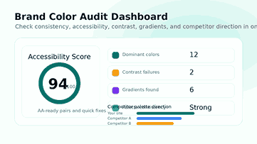
Why Contrast Comes First
Strong contrast makes for scannable content. It makes headings pop, keeps buttons visible, and is excellent for long reading sessions. Better contrast can also help with the usability of forms, the clarity of navigation, and the mobile experience.
Once you pick a clean color palette, you also must optimize website images to keep your pages quick, light, and user-friendly.
Use the contrast lab before you post
Before you go live with a design change, test important text/background combinations. Test the contrast of hero text, buttons, cards, form fields, navigation links, badges, and the footer. Small contrast tweaks can really make a page look more professional.
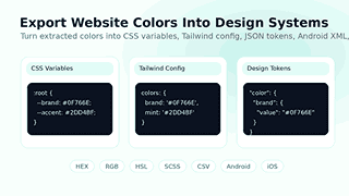
Design Token and Developer Exports
A good color tool shouldn’t end at the palette. Teams require color values in a format they can directly consume. This tool provides support for exporting for design systems, front-end development, and cross-platform projects.
Furthermore, exported palettes are useless to developers unless they know the CSS color values. Now you can get the right HEX, RGB, HSL, and other color formats easily.
Export colors to CSS variables, SCSS variables, JSON, CSV, Tailwind config, design tokens, style dictionary format, Android XML, iOS Swift, and plain text. These formats help teams maintain consistent colors across websites, in apps, and in internal documents.
Make Research Reproducible
When you extract colors from a website and make them into tokens, you’re creating a reusable source of truth. Developers can insert tokens into the code, designers can annotate palette roles, and teams can avoid haphazard, one-off colors.
Best Practices for Using Website Colors Derived
Begin with the dominant colors
Begin with the most popular colors. They are usually the basic framework of the website, background systems, major text tones, and large brand areas.
Distinguish between Brand Colors and Utility Colors
Don’t use every color as your brand color. Some colors are used for utility purposes, e.g., borders, shadows, alerts, backgrounds, or disabled states. Keep your palette clean. Group colors by purpose.
Minimize Unnecessary Color Changes
Over time, a large website can accumulate too many similar shades. Use the extracted palette to identify duplicates and near-duplicates. Then reduce the system to a smaller set of intentional colors.
Verify colors on the telephone
Mobile users are looking at websites on every screen and brightness level. Test critical color combinations in mobile layouts such as buttons, sticky bars, form fields, and small text.
Create Your Final Palette
Pick the final colors. HEX values, final document colors, document names, roles, and usage rules are included. Good documentation helps designers, developers, writers, and marketers use the palette consistently.
Please consider using TextRefine to help make what you write more readable to visitors and improve the clarity of your writing before you publish your design guide or tool page.
Common Use Cases
Design a Brand Color Scheme
Create a simple color guide for your brand using the colors of your site. Arm your website to the teeth. The guide should include primary, secondary, accent, neutral, background, text, and warning colors for the brand color palette.
Review of Website Redesign
Run the tool before redesign and post-redesign. Please review the snapshots to confirm that the new design incorporates the correct brand colors. This is a good way to filter out old and inconsistent tones.
Color Study for Landing Page
Look at high-converting landing pages for contrast, accent colors, and calls to action. Leverage this knowledge to hone your design approach.
Developer Delivery Ready
Share export colors with developers, code-ready. It reduces back and forth and helps ensure the final build is consistent with the design intent.
Make the Website More Accessible
Apply the contrast lab and audit to identify poor color combinations. Change the text and background combinations before users have difficulty reading.
Who Can Benefit From This Tool?
Freelancers can use it to screen clients. Agencies can use it to audit and review their competitors. It lets developers pull colors fast. Brand teams can use it to audit brand consistency. It’s a tool for content teams to boost readability and visual trust.
It is especially powerful for website audits, brand refreshes, UI inspiration, design system setup, accessibility reviews, and marketing page analysis.
How to Turn Extracted Colors Into a Strong Palette
Select a Main Color
Choose the color that fits your brand and start now. This color is used heavily for logos, primary buttons, primary highlights or navigation Use this hue as an anchor to the rest of the palette.
Add Supporting Accent Colors
Accent colors should be noticeable but not overpower the page. Use them in buttons, links, badges, highlights, icons, and other small interface elements that need to attract attention.
Build a Neutral System
We generally like neutral colors for reading.” They support backgrounds, cards, borders, dividers, muted text, and layout structure. A clean neutral scheme can make a website look more serene and professional.
True UI Role Color Distribution
To make a palette useful, you need clear roles. Choose a color for primary actions, secondary actions, text, headings, backgrounds, borders, success messages, warnings, and errors. Role-based decisions minimize random color usage.
How Color Impacts User Trust and Conversions
People make snap judgments about a website. Color goes a long way toward forming that first impression, setting the mood, structure, and clarity before a visitor even reads a word. A consistent color palette can make a tool, product, or brand more reliable.
The buttons too depend on the clarity of the color. Without a call-to-action in the layout, users may not notice it. The button is useless if the accent color is everywhere. With a clean palette, important actions pop naturally.
Use color to guide your reading
Excellent colors help users read faster, but your text is also essential. Before you publish the page, you can check its readability and keyword density.
Most readers will glance over a page before they decide to read it. Good headings, visible buttons, clear cards, and consistent link colors help the user understand the layout quicker. This will create a better experience on desktop and mobile screens.
Minimize visual noise
Too many colors can make a page feel too hectic. Pull a website palette and beware of unnecessary variations. Culling unnecessary shades, merging similar shades, and keeping only useful colors.
Mistakes to Avoid When Using Website Colors
Don’t use a competitor palette
The point of competitor research isn’t to copy someone else’s identity, but to make smarter decisions. Use the extracted palettes to get to know your market and then go another way that is good for your brand and audience.
Text colors should not be ignored
Many teams focus on bright brand colors and forget text. Text color matters because it governs readability. Always check headings, body copy, muted copy, links, and button labels post-extraction.
Don’t Use All Extracted Colors
A site might have old colors, plug-in colors, third-party widget colors, or accidental one-off values. The list that is extracted is research data. Curate a clean final palette before shipping a design system.
Test contrast; don’t forget
You might like the color, but it may not work in practice. Before going to market, test the most critical combinations. Small text, form labels, navigation, footer links, and CTA buttons may not display correctly.
How to Write Better Design Documentation With Extracted Colors
How to Use the Color when Pulling Colors from the Website. Add color names and hex values. Examples, limitations, and UI roles: Proper documentation will save you from confusion later.
Design teams can upload screenshots and palette swatches and export files for handover. It serves as a single source of truth for developers and marketers and reduces errors when running campaigns or redesigning and updating content.
Keep the structure clean when documenting your final palette. This tool can help you format and optimize content for better readability and SEO.
Development of Naming Rules
primary: #007bff secondary: #6c757d accent: #28a745 background: #f8f9fa surface: #ffffff text: #212529 muted: #6c757d border: #dee2e6 success: #28a745 Warning: #ffc107 danger: #dc3545 Export names are more descriptive, and teams are less likely to use vague names.
Review the color palette periodically
As the site grows, the palette can become less distinct. Review colors after major theme updates, landing page launches, plugin changes, and rebrands. Regular checks ensure the visual identity is on point and consistent.
Use the Same Palette Across the Team
“It’s better to have all the teams using one single source of truth for picking colors. Share the extracted palettes with designers, developers, writers, and marketers. Everyone should know which colors to use and which to avoid in the final design.
Why Choose This Website Color Palette Extractor?
The tool merges extraction, organization, contrast review, competitor comparison, snapshots, quick filters, and export options into one workflow. It does more than name colors. It tells users what those colors mean and how to use them.
A satisfactory color workflow should address three questions: What colors does the website use? What do those colors do to the UX? And how does the team correctly reuse them? This tool answers all three with a clean, practical interface.
Frequently Asked Questions
What is a website color palette extractor?
It examines a web page and detects the colors used in the visual layout of the page. It shows HEX codes, color functions, dominant colors, gradients, and palette data ready to export.
Can you grab colors from the URL of any website?
You can crawl public web pages that the tool can access. Some sites block automated requests and hide their styles behind scripts, etc., to prevent crawling. Scan regular pages.
Is the tool only for detecting hex colors?
The tool is aiming for real-world color values and exports. You can use hex values and export palettes in CSS variables, SCSS, JSON, Tailwind config, design tokens, Android XML, and iOS Swift formats.
Is this also an accessibility tool?
Yes, the tool can help you check text and background color combinations for low-contrast pairs that can influence readability. This is not an accessibility conformance evaluation but a design support tool.
Can I use this tool to spy on competitors?
Yeah. Check out other sites for palette comparisons and see how they use color. – Don’t just steal ideas from research and strategy.
Why should I export colors as design tokens?
One of the most typical use cases for design tokens is color. They want to help designers and developers to keep their brand color consistent across websites, apps, components, and documentation.
Final Thoughts
The website color palette extractor is a quicker way to understand, audit, and reuse the colors behind any website. It eliminates uncertainty and provides you with organized color data to enhance your design decisions.
Try it to analyze websites, improve brand consistency, test contrast, build design tokens, benchmark competitors, and build cleaner visual systems. The easier it is to understand your color system, the easier it is to trust, read, and use your website.